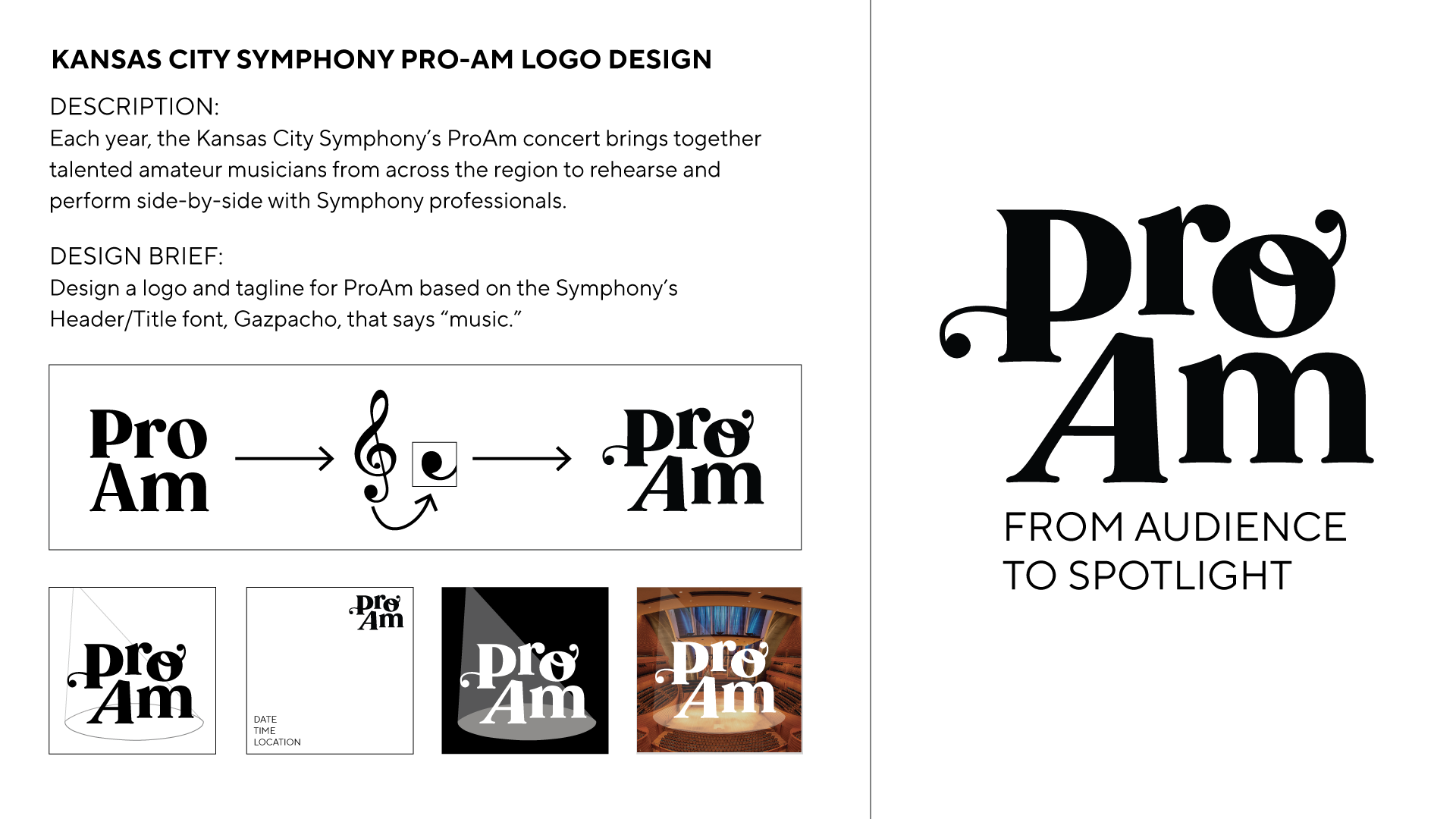
As the in-house designer for the Kansas City Symphony I was given the opportunity to use their new logo and identity created by BarkleyOKRP to fully bring the orchestra into a welcoming and modern visual world, ultimately leading to increased sales and attendance.
Over time, I lead creative direction across concert branding, seasonal branding, and in-house photography—blurring the line between design and art direction to craft modern audience experiences while keeping the musicians front of mind.
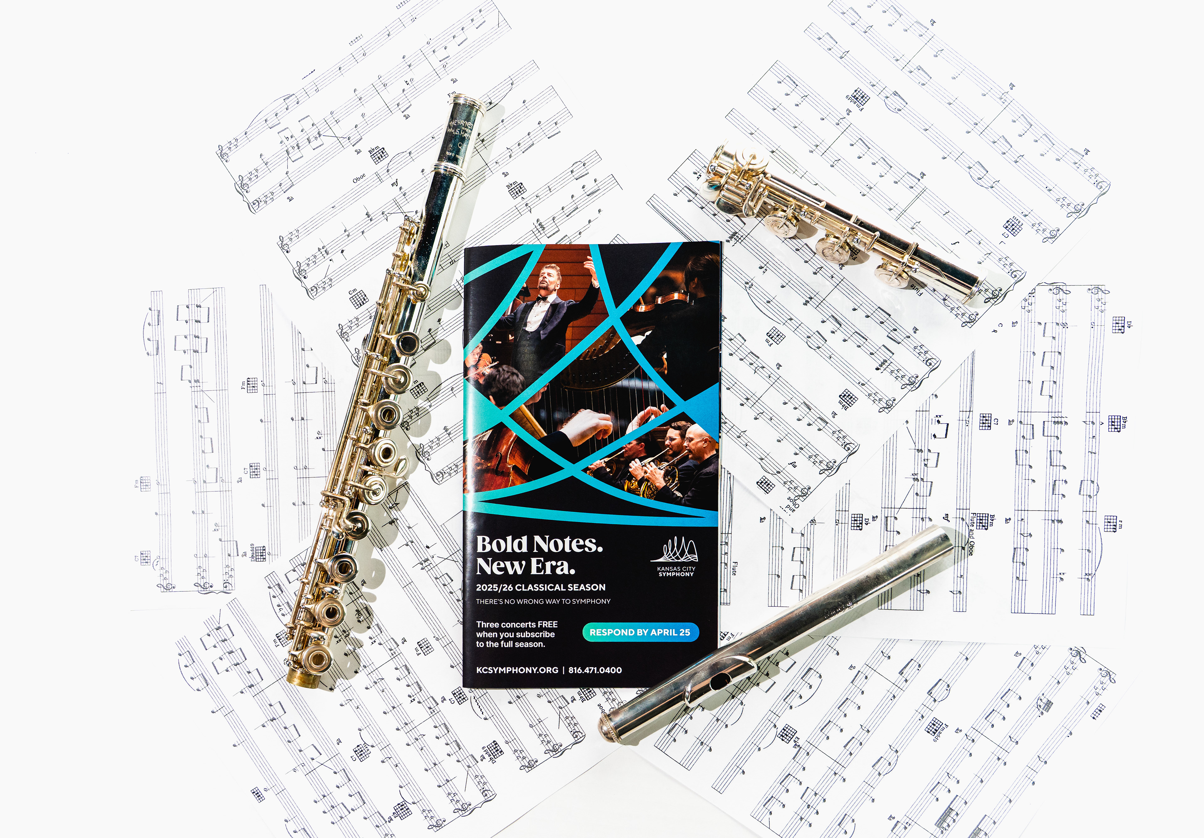

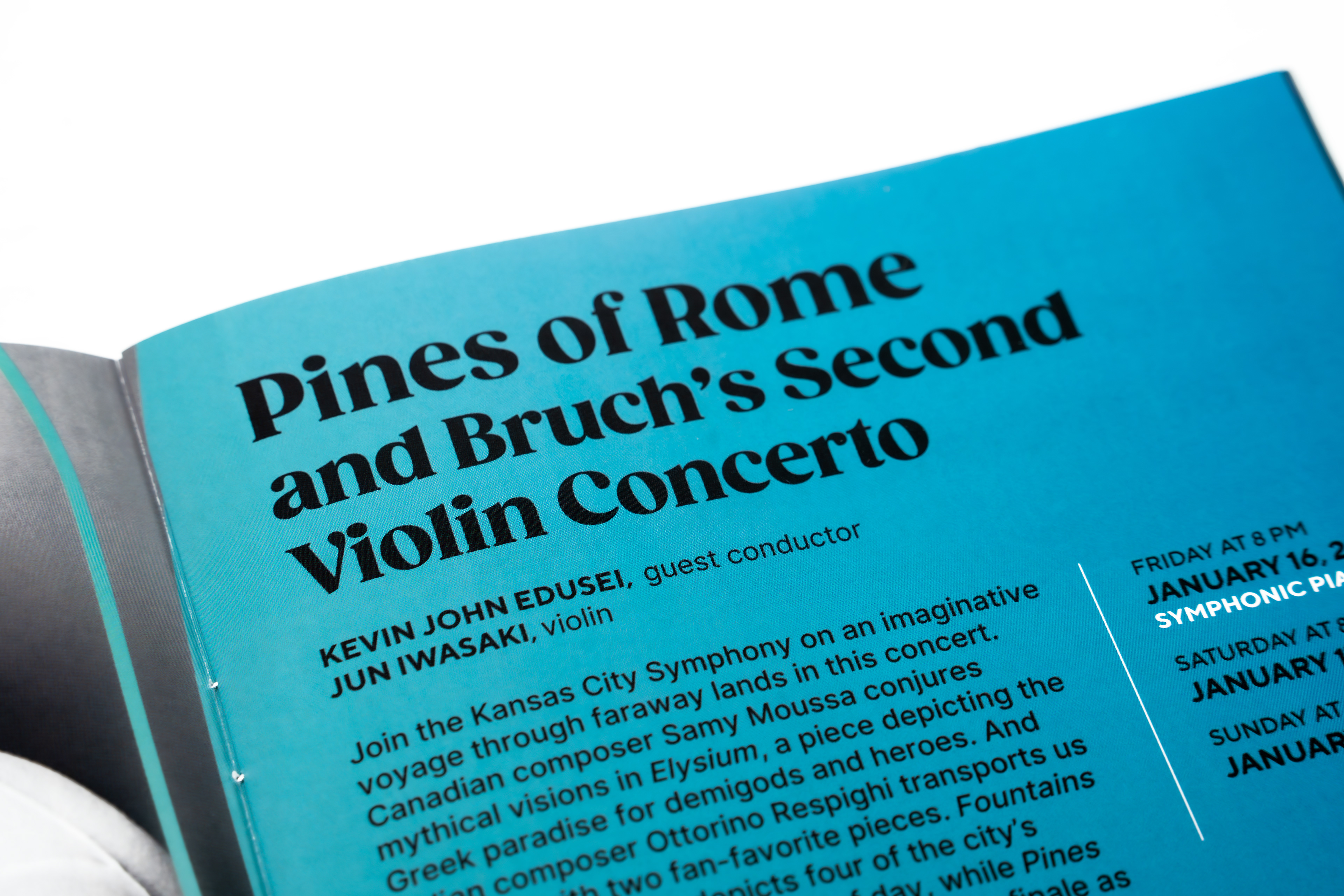
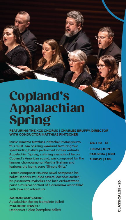
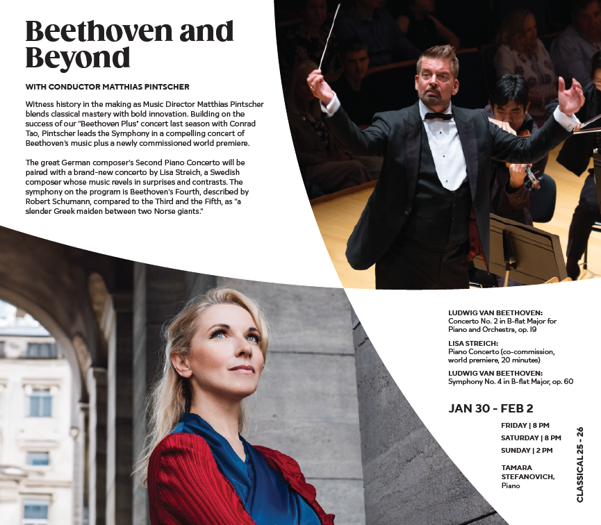
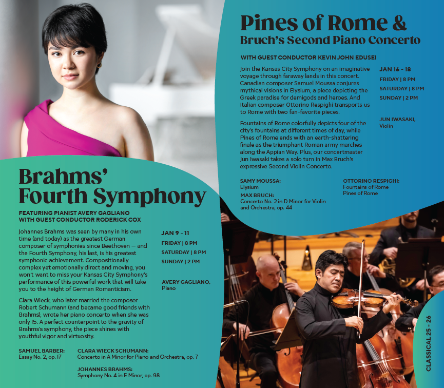
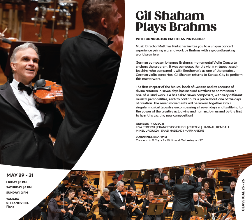
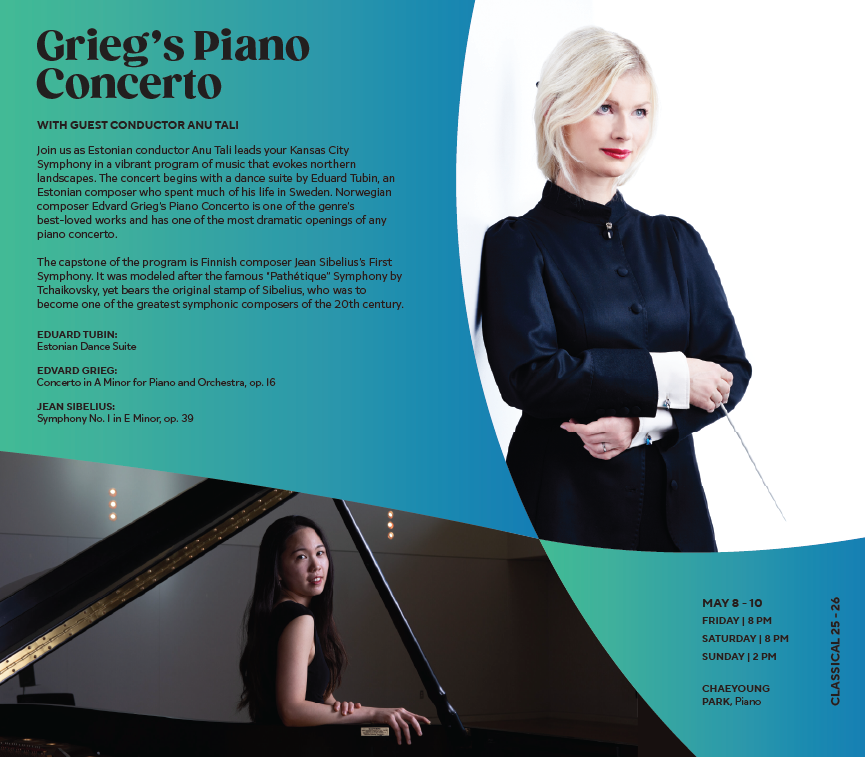
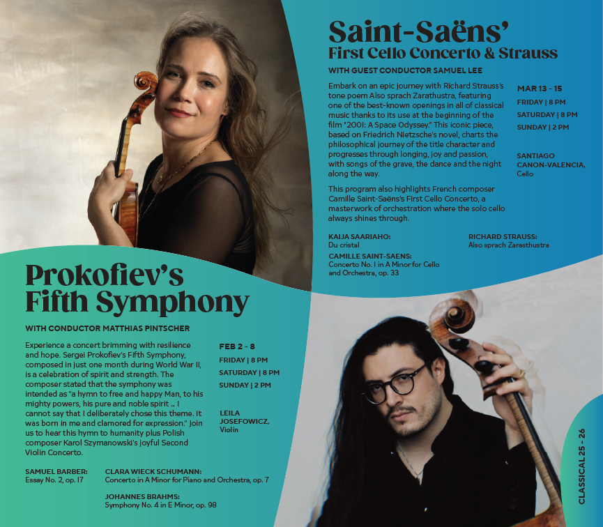
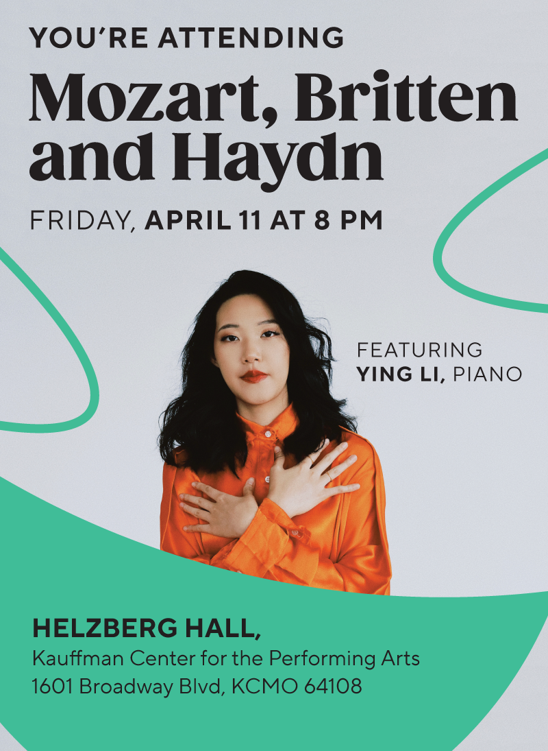
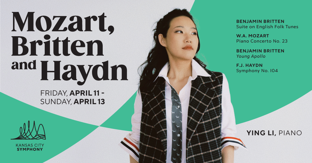
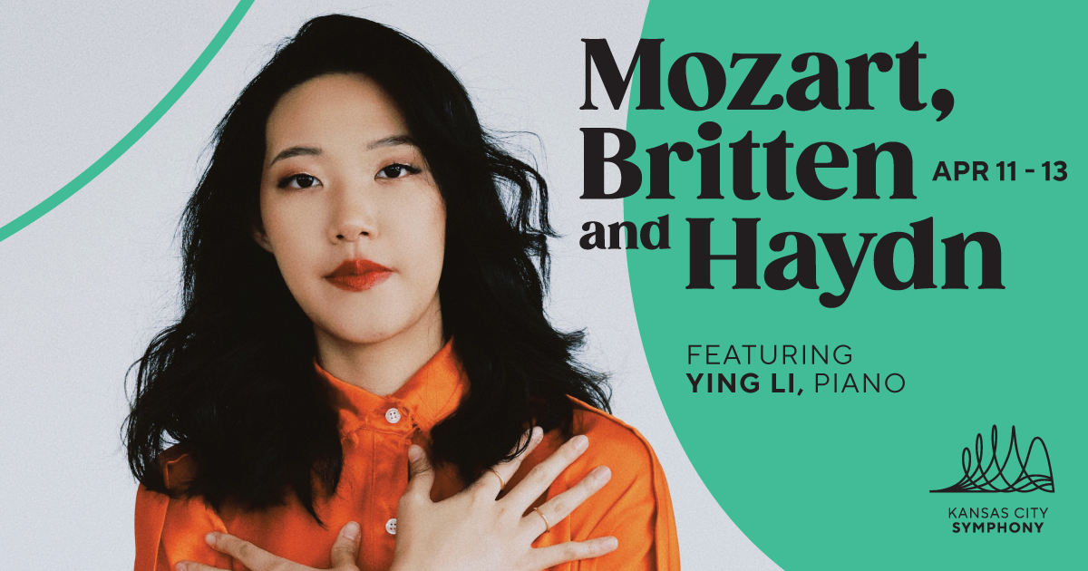
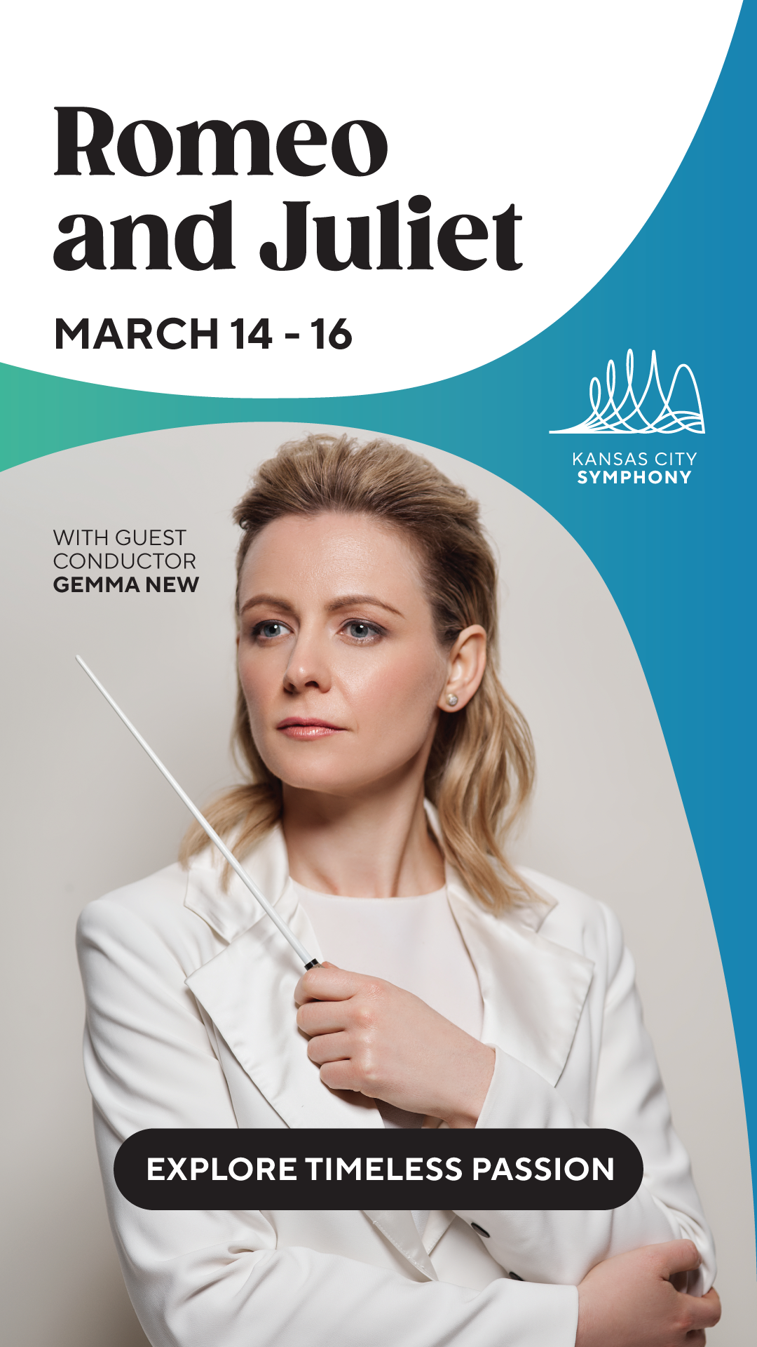
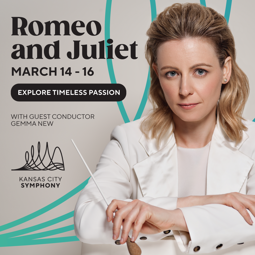
I created the 2025-2026 Classical and Pops programs sent to tens of thousands of homes in the Kansas City Area, creating the first official printed season programs with the new visual identity system.
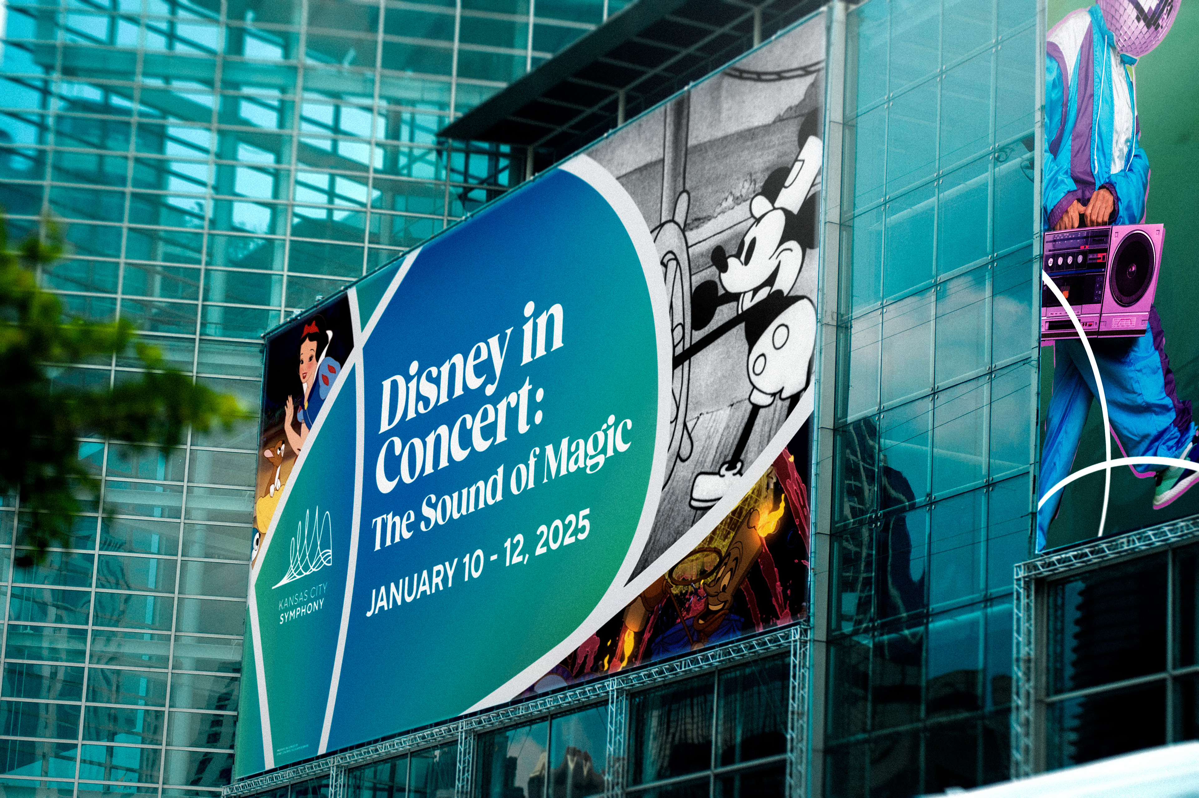
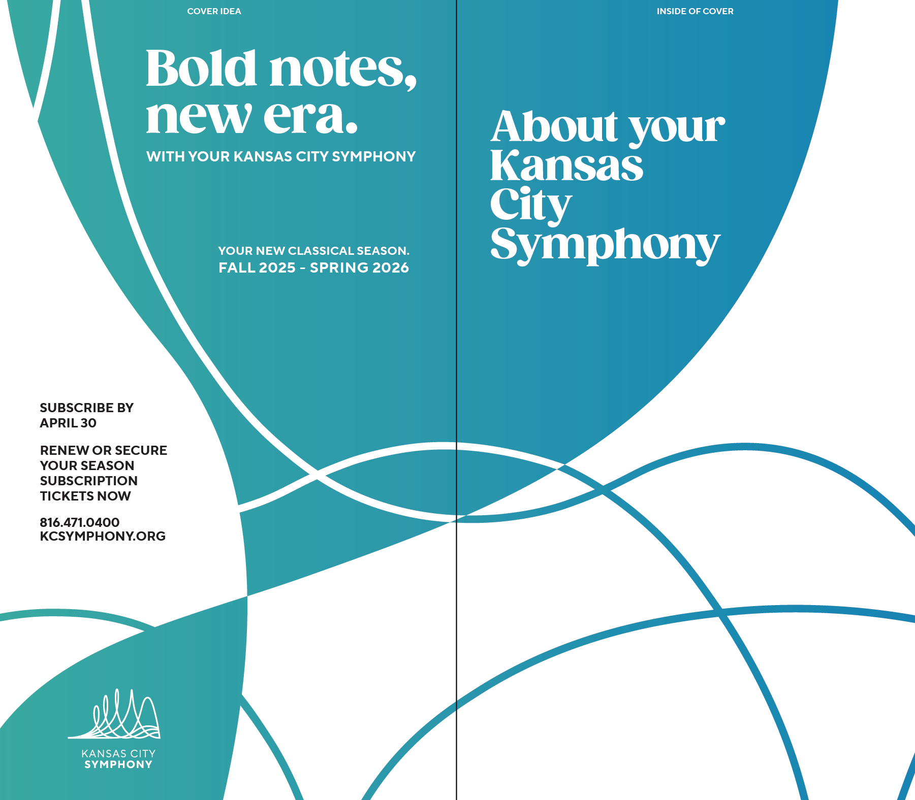
The idea was to use our brand's waveforms to create separation between pages and spreads, text and image. We want to push the new identity of the Symphony throughout Kansas City, just like our sports teams, because Kansas Citians LOVE KC.
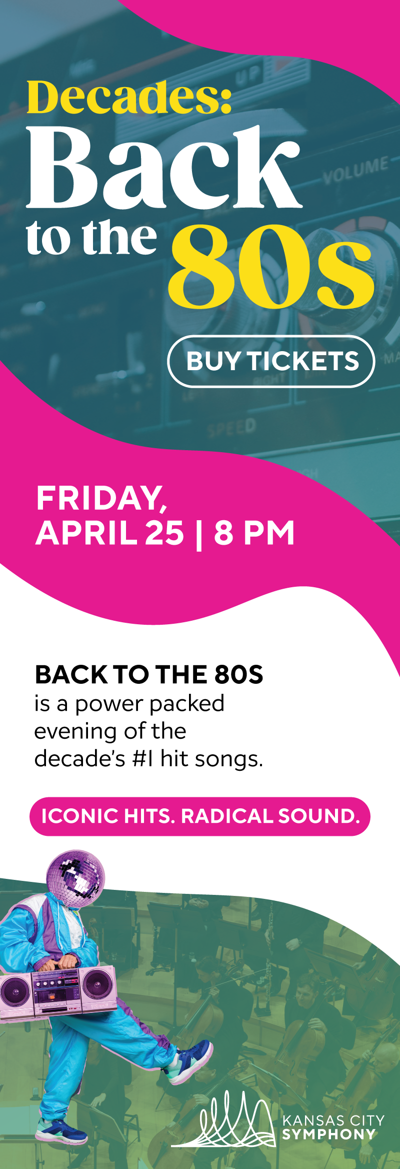
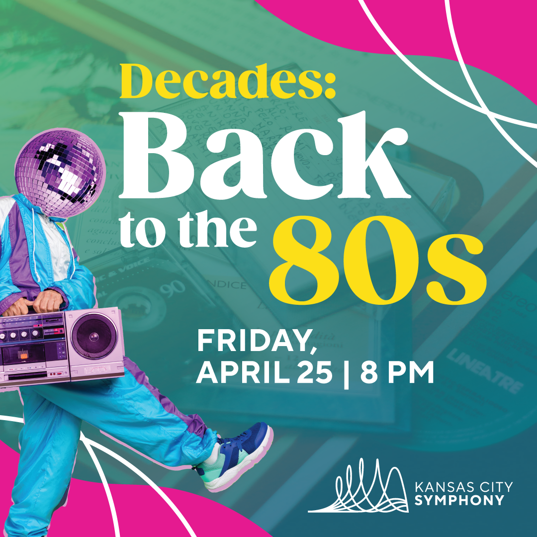
Below are examples I provided to further the sound wave iterations through the Classical and Pops identities. I also did the copywriting for "Bold Notes. New Era." which is the new 2025-2026 KCS tagline. This was to show the abilities of just design and typography within our identity to create bold, recognizable imagery.
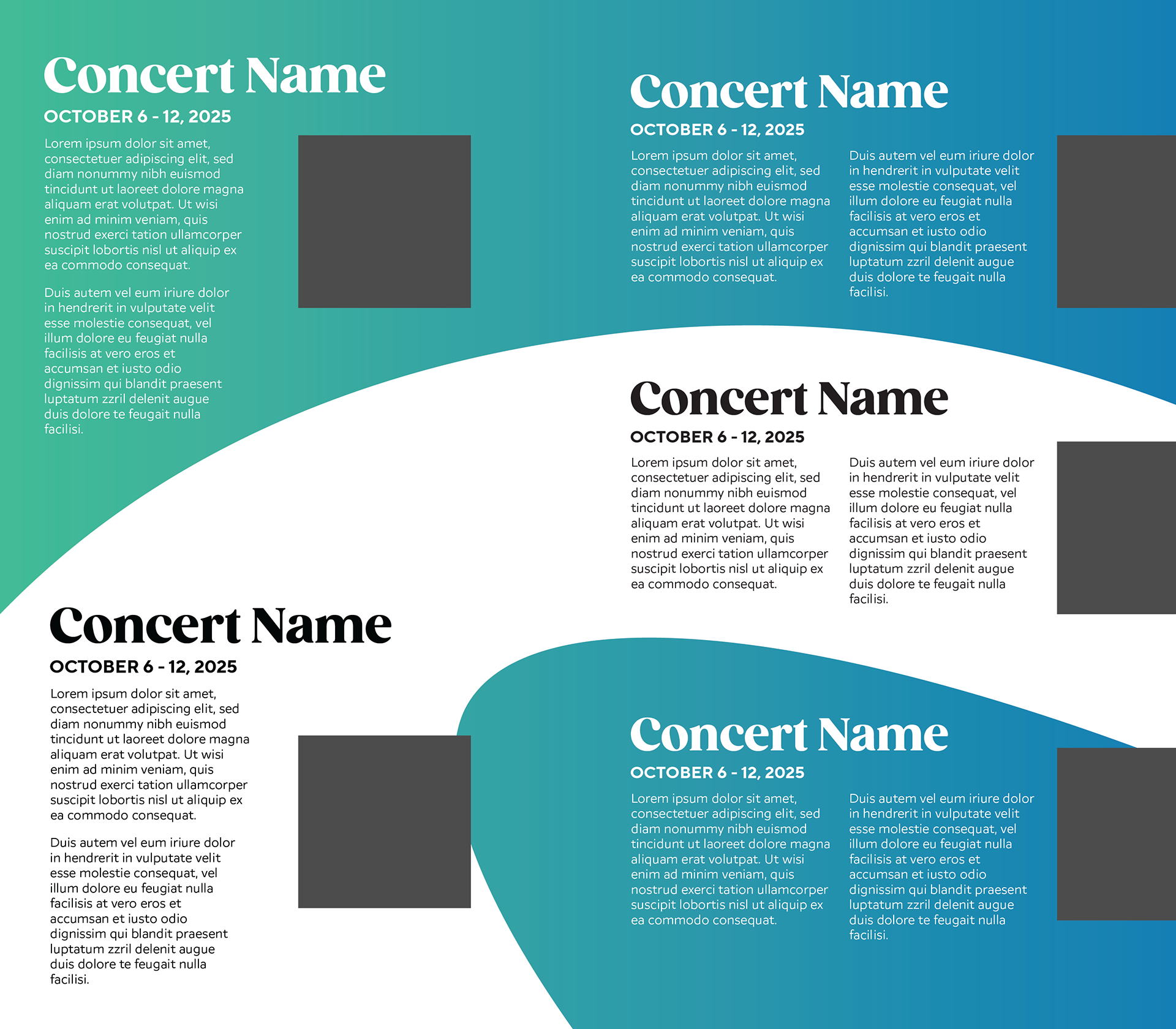
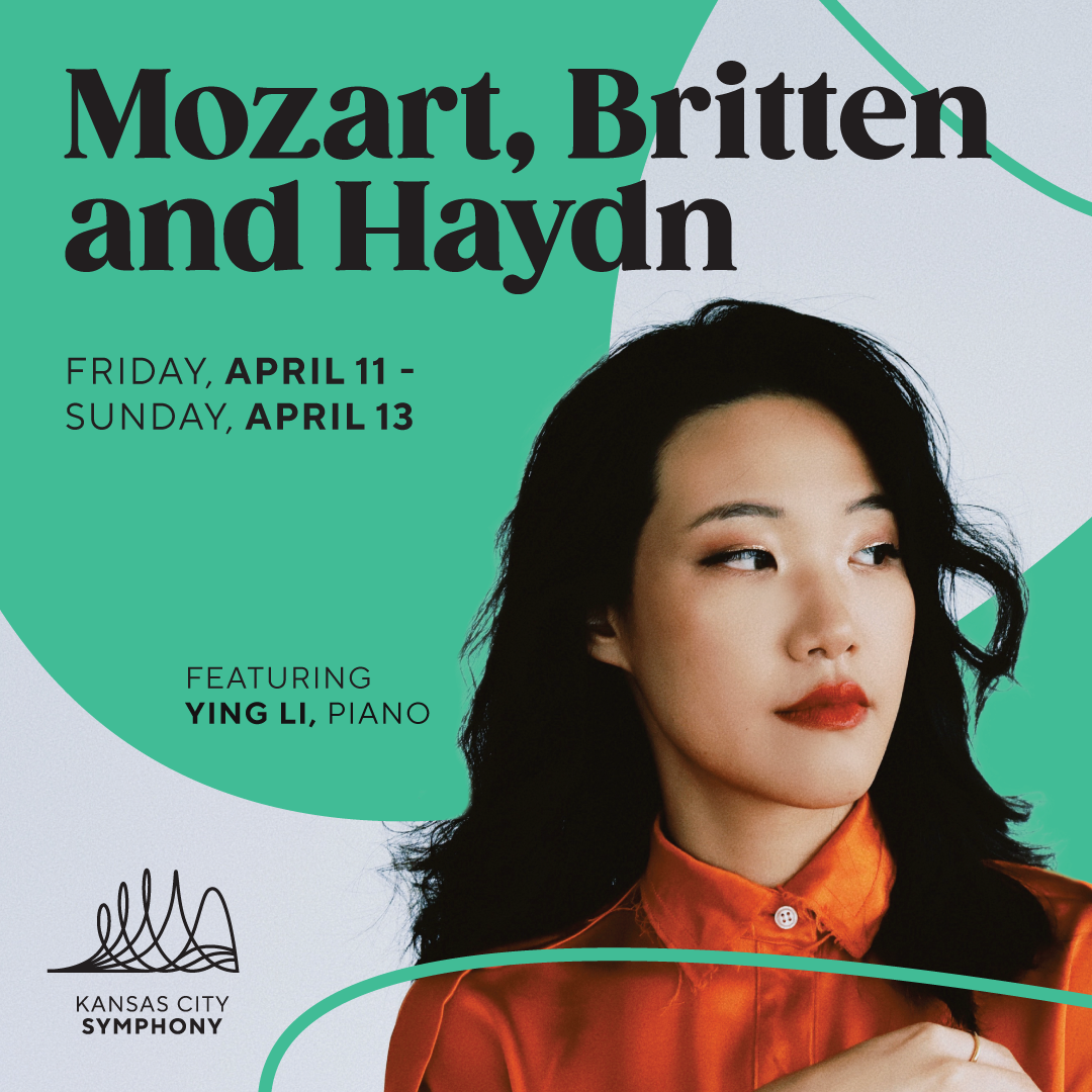
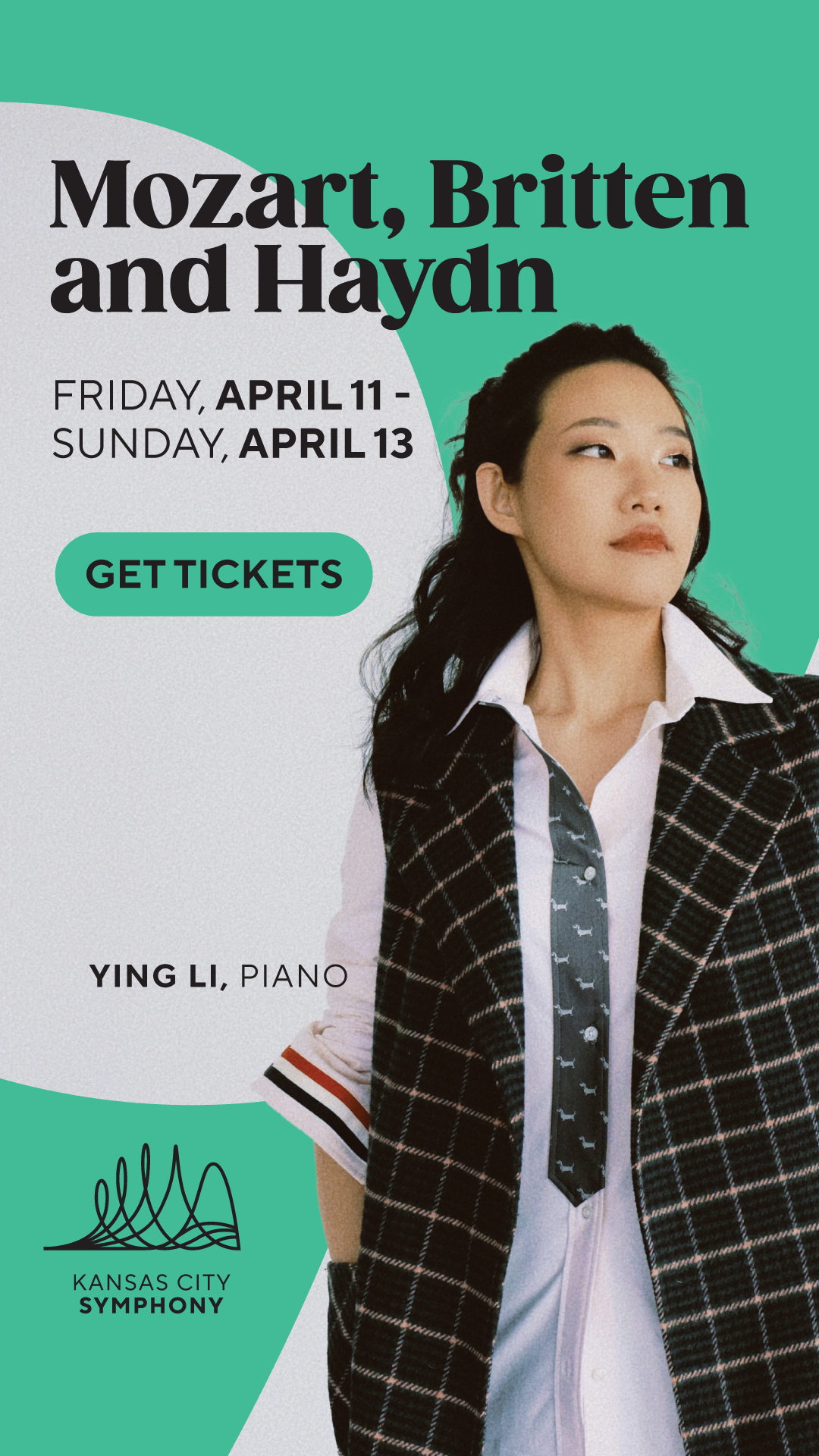
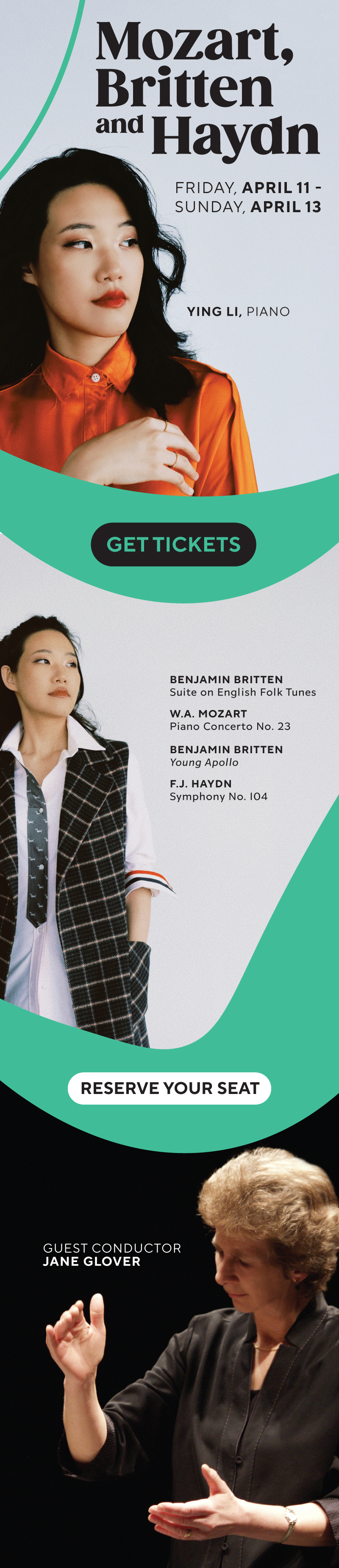
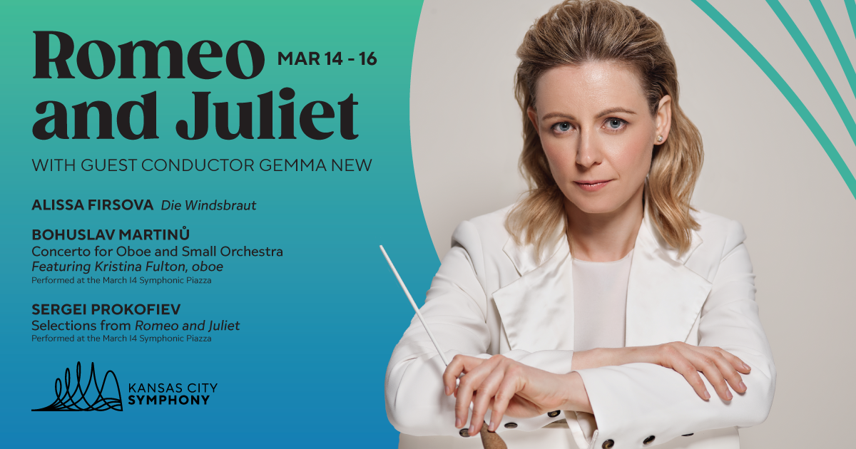
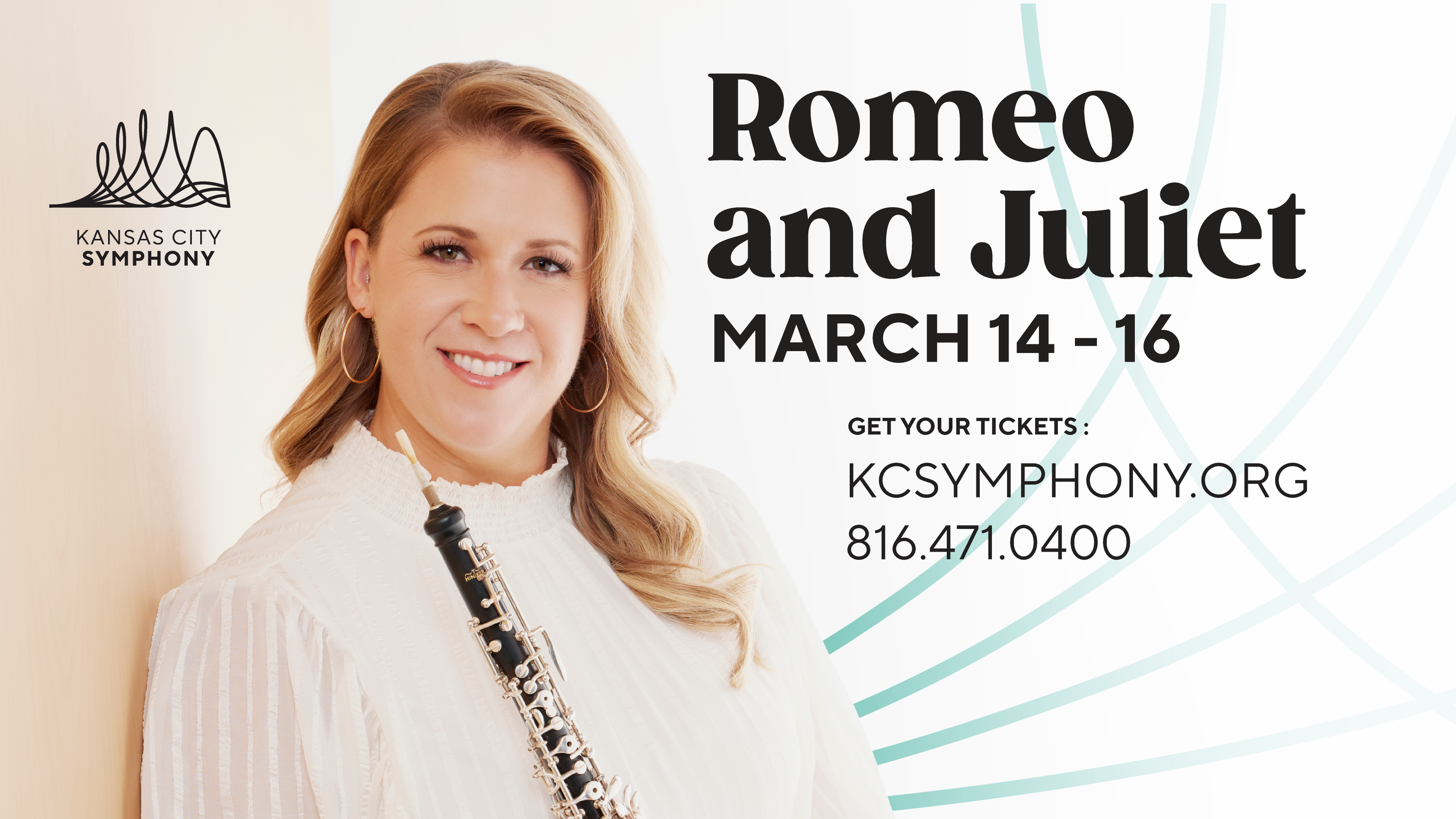
CONCERT IDENTITY EXAMPLES from 2024/25
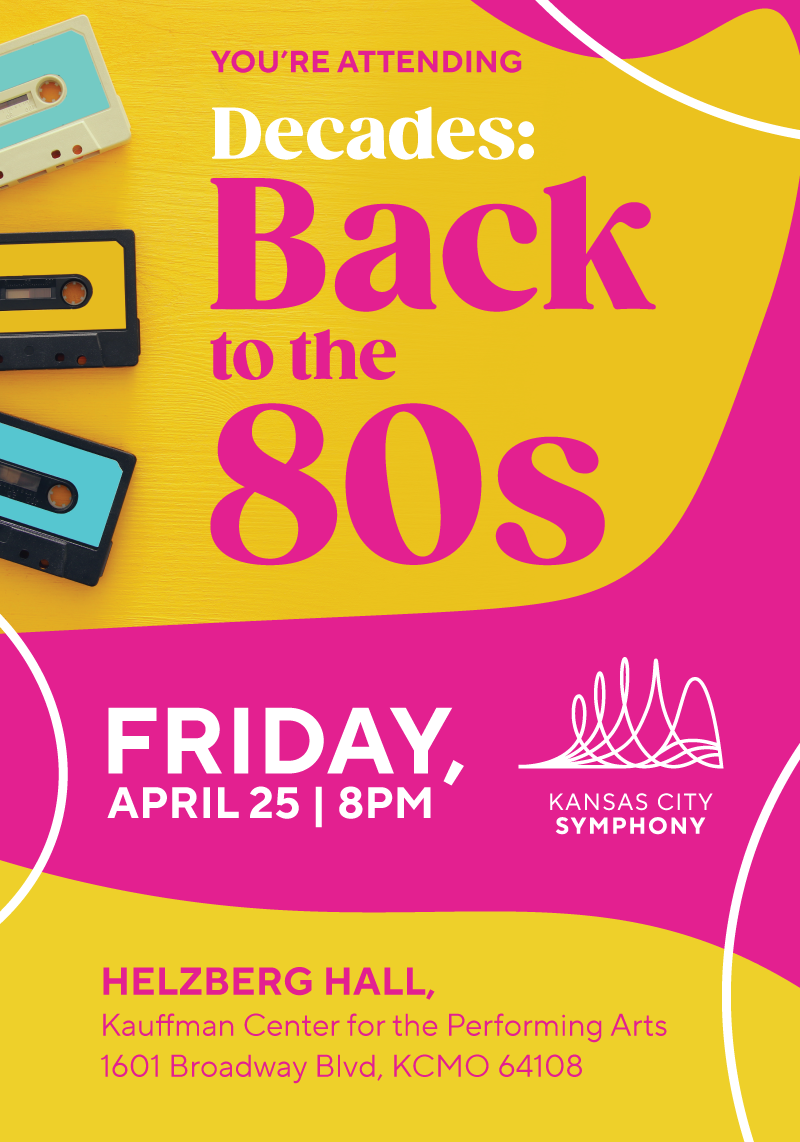
The direction I received for the first year of the Symphony's new design was simple - use guest artist assets and our colors and fonts to create a unique look for the Classical series. Pops/Special Presentation series take on a more unique look.
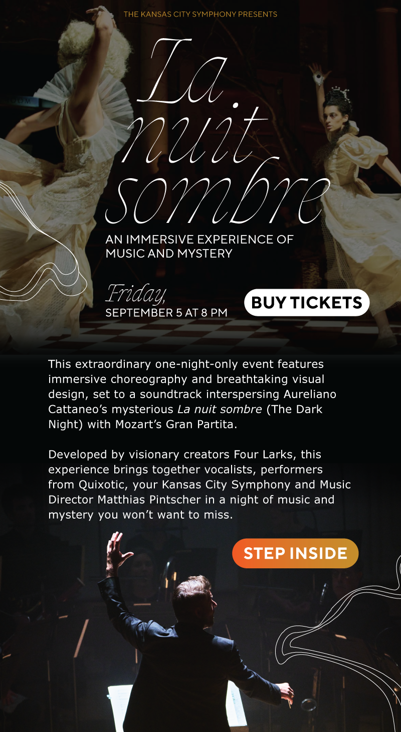
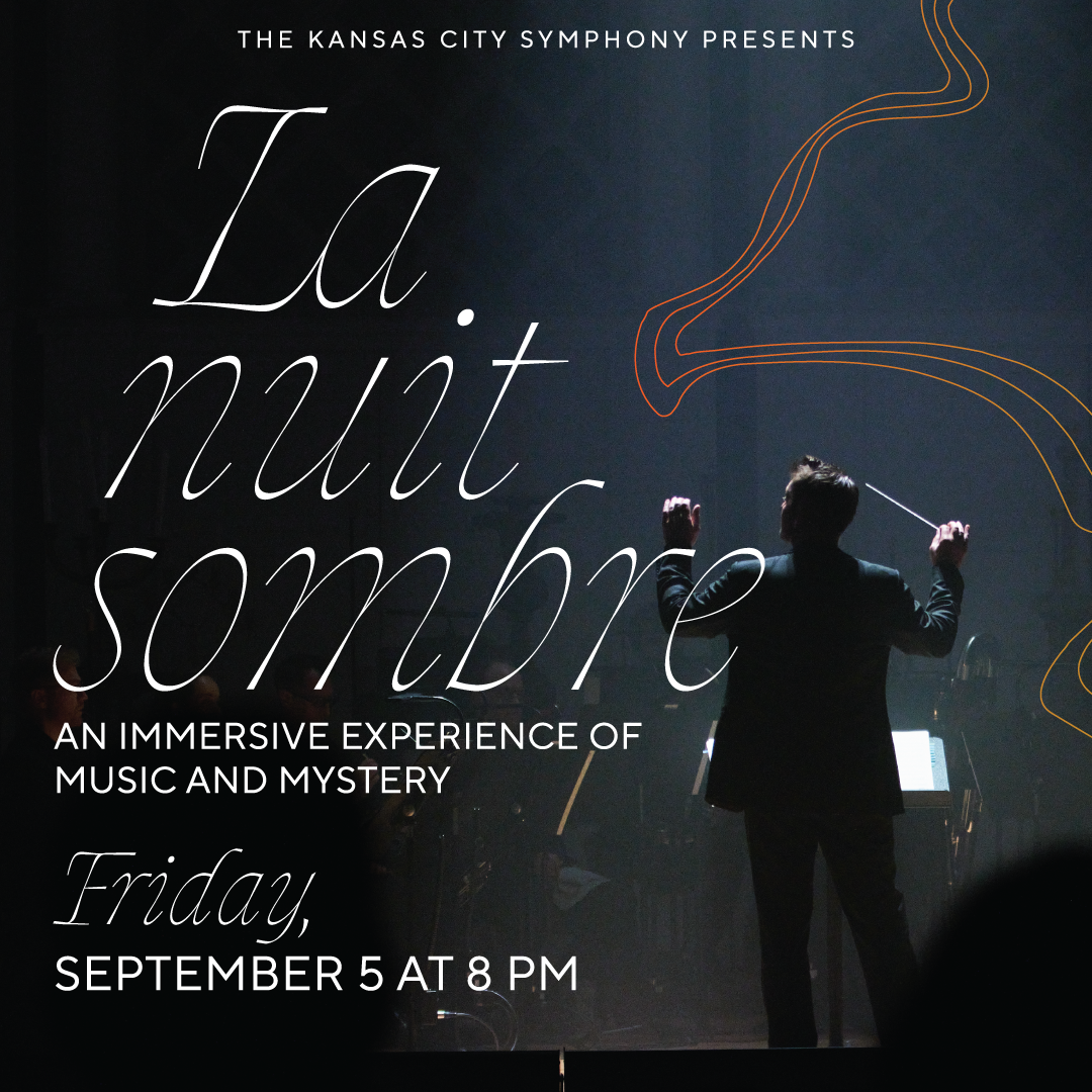
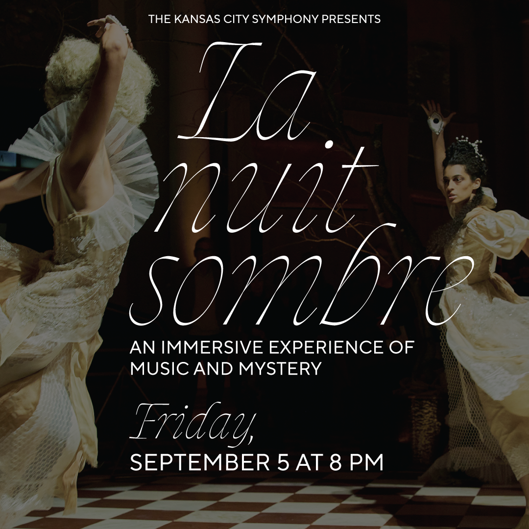
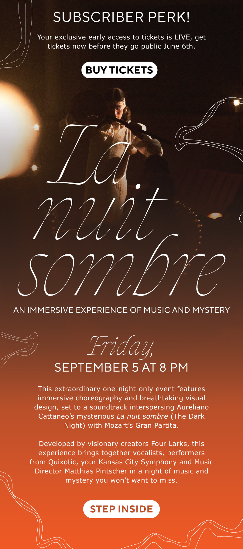
La nuit sombre is a one-time project with Four Larks, a totally unique immersive experience performance. This required a more unique title typeface to differentiate from more expected Symphony performance content, but still includes the Subtitle font TT Norms.
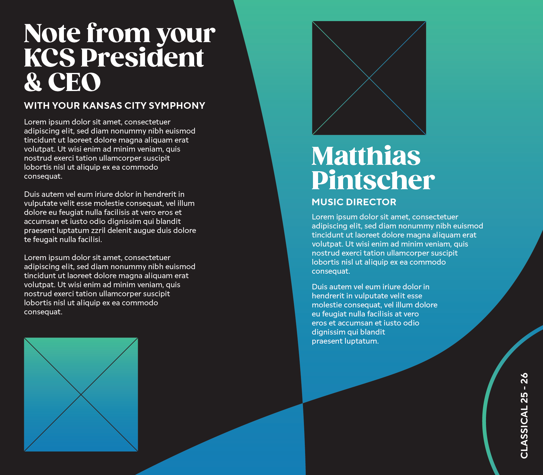
ART DIRECTION
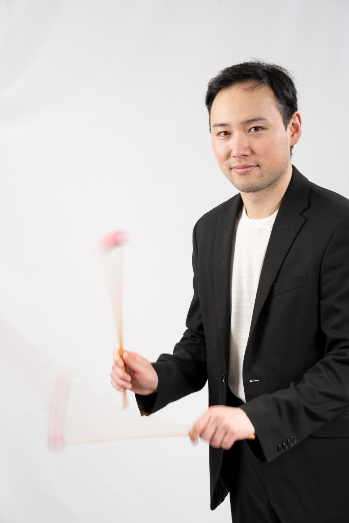
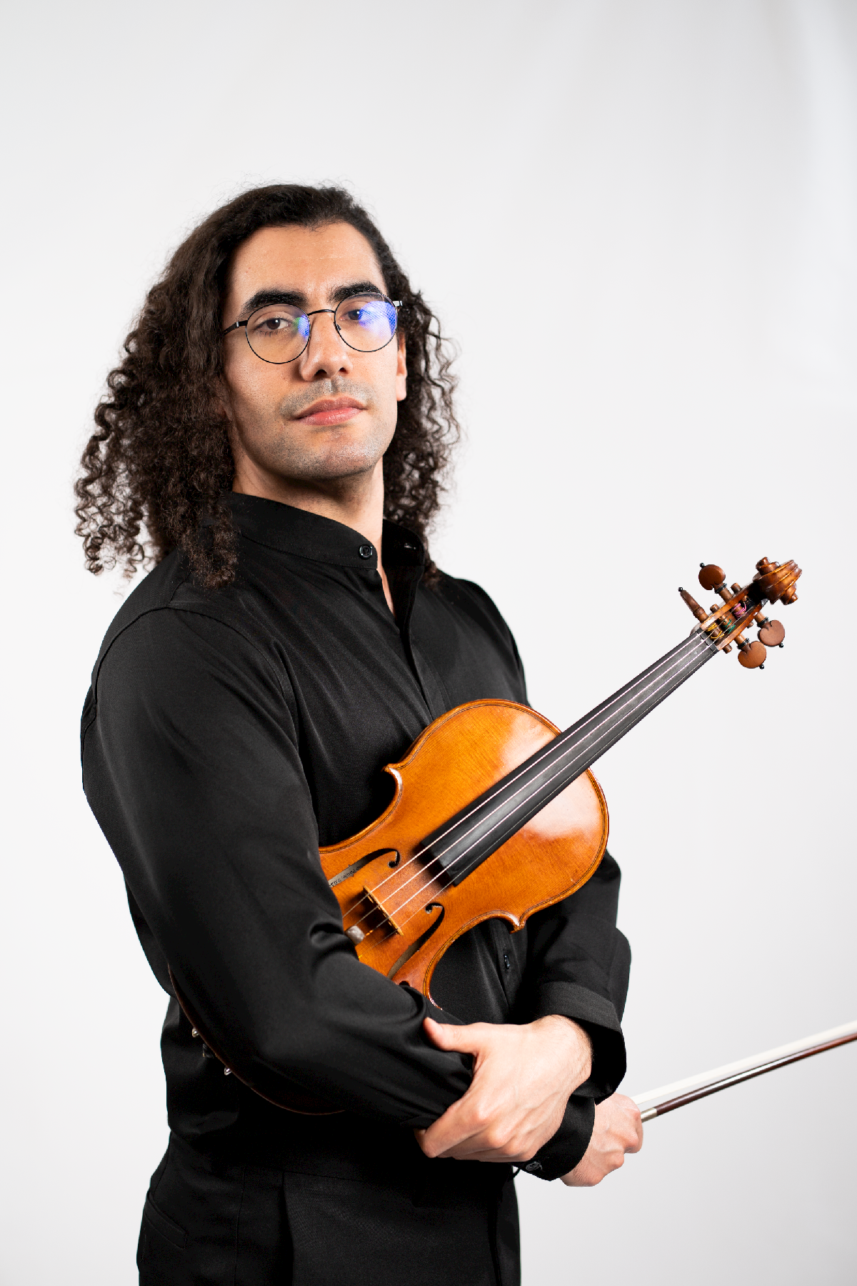
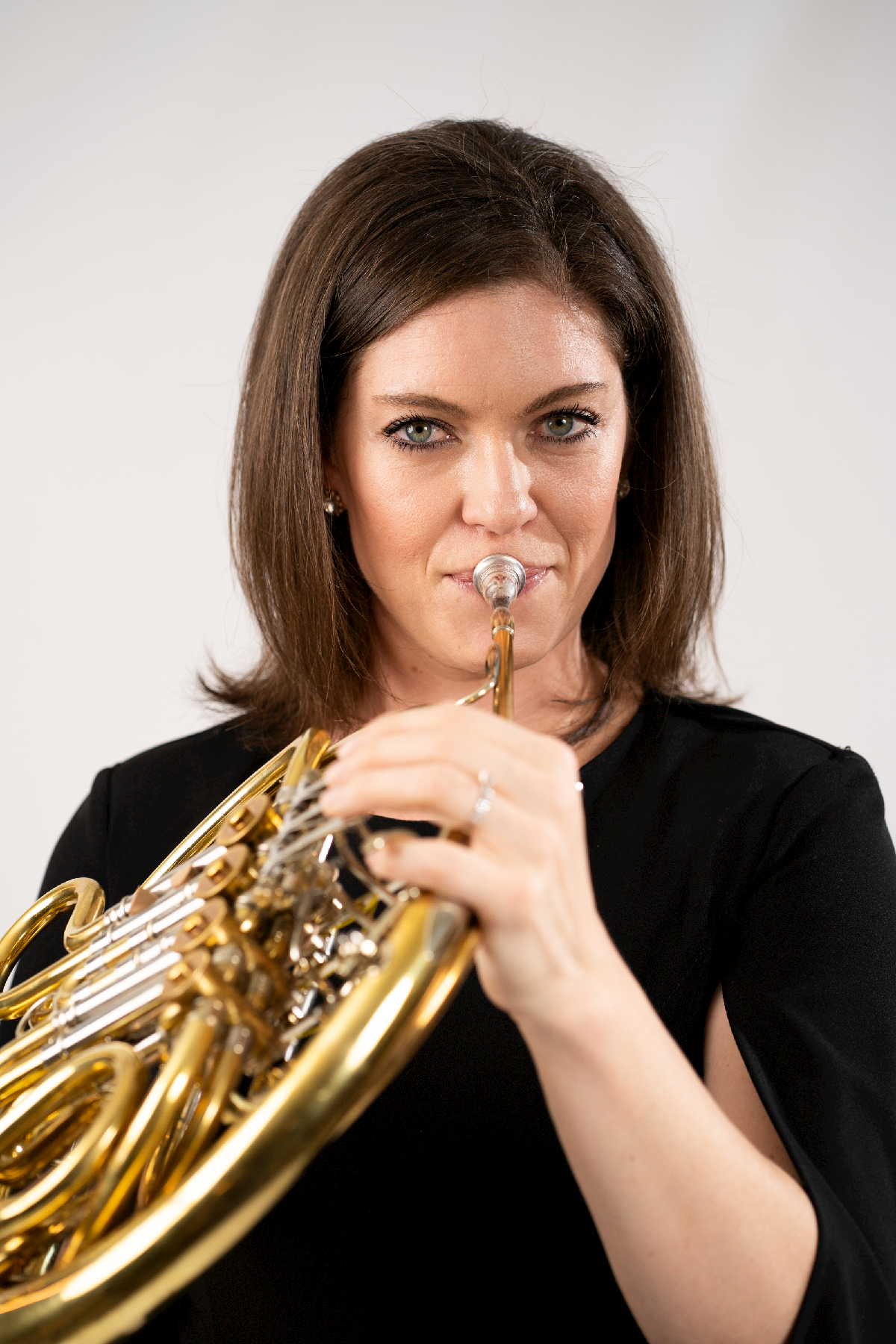
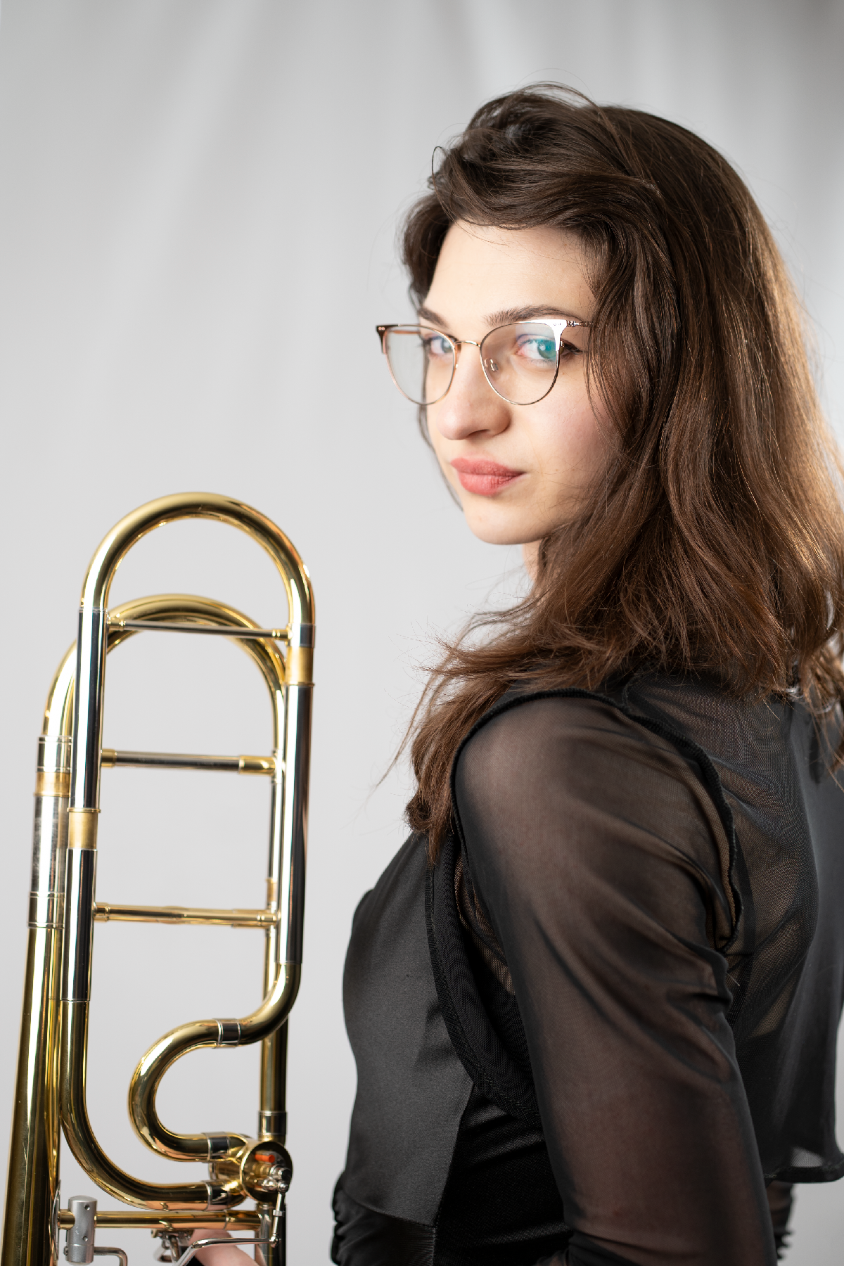
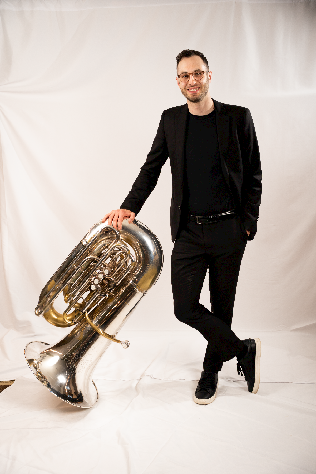
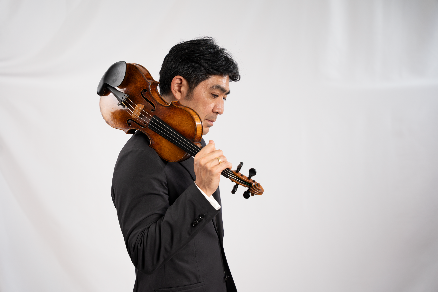
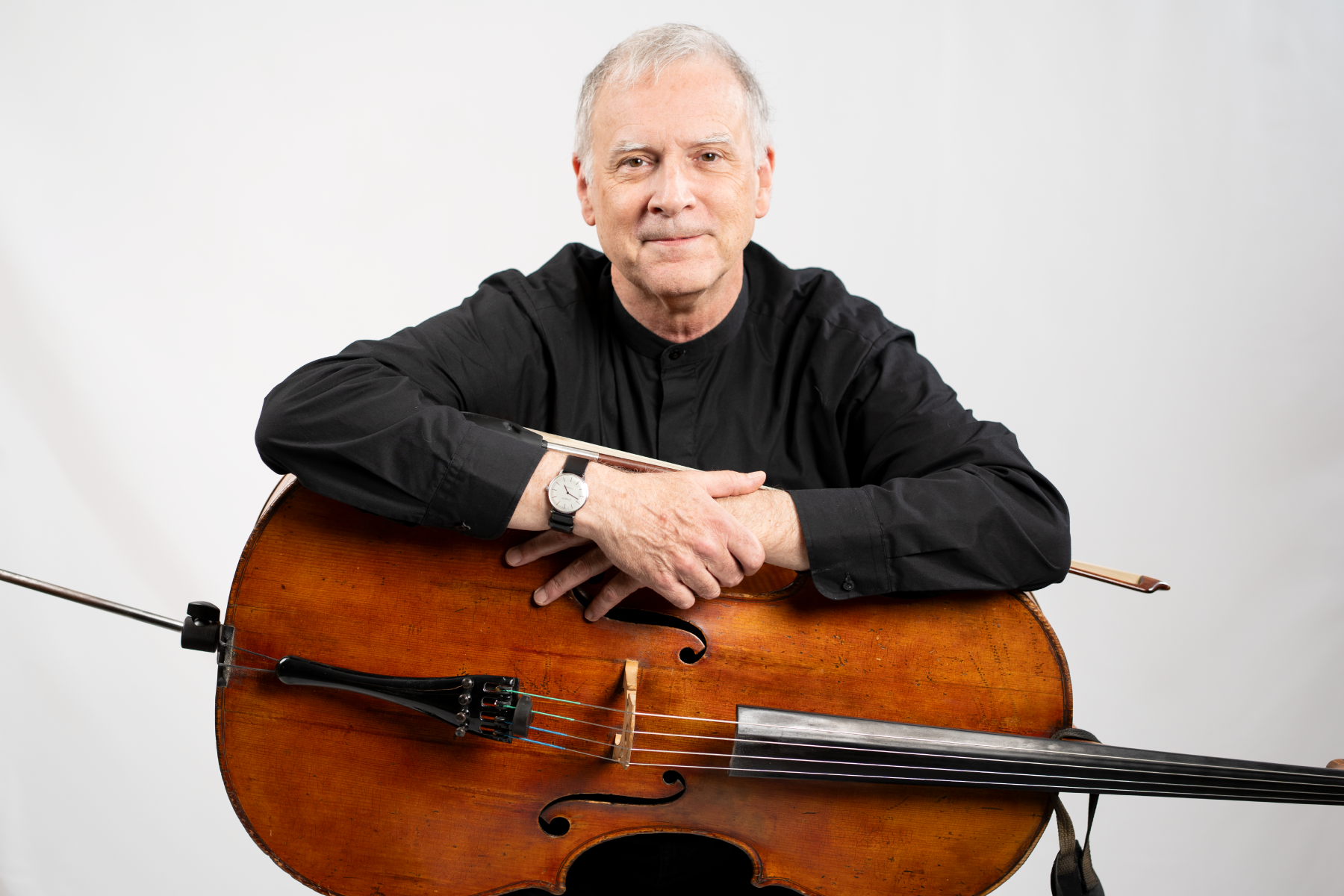
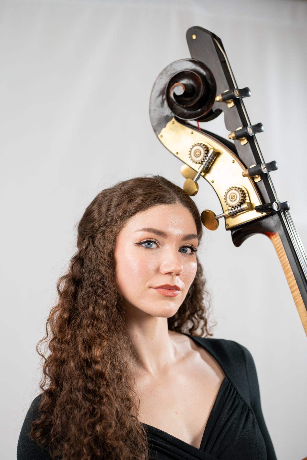
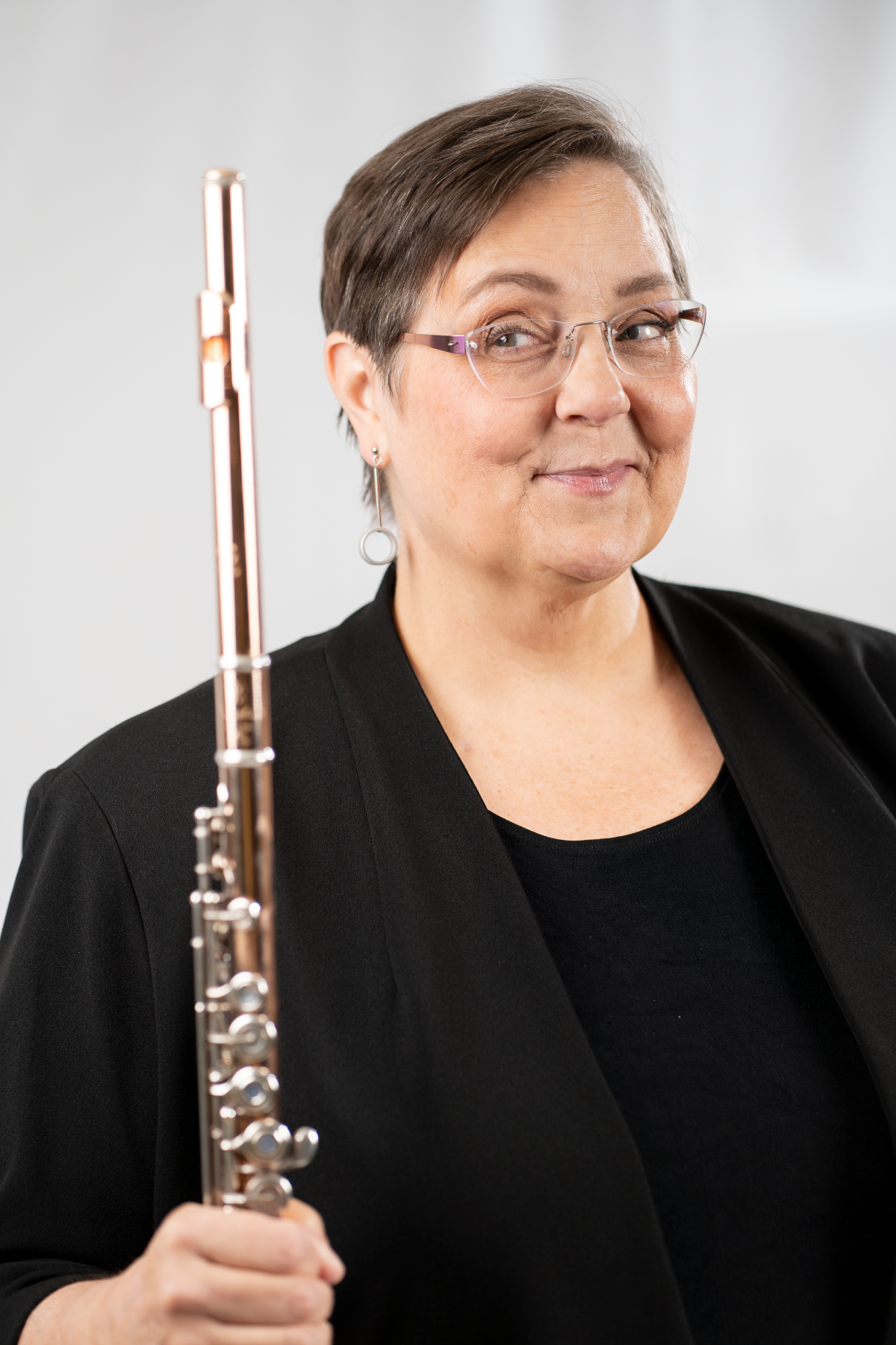
I led the photography for the 2025/26 season to capture our musicians in a fun and professional light. I created moodboards with example images along with style guides for the musicians, ultimately hoping for a slightly more casual vibe. These are some of the best musicians in the world - but they are people like anyone else.
I directed the musicians through a variety of poses and photographed all of the below.

Product photography by Joseph Pieken