NEW MUSEUM
Identity Systems | Logo Design | Mockups
LOGO DESIGN
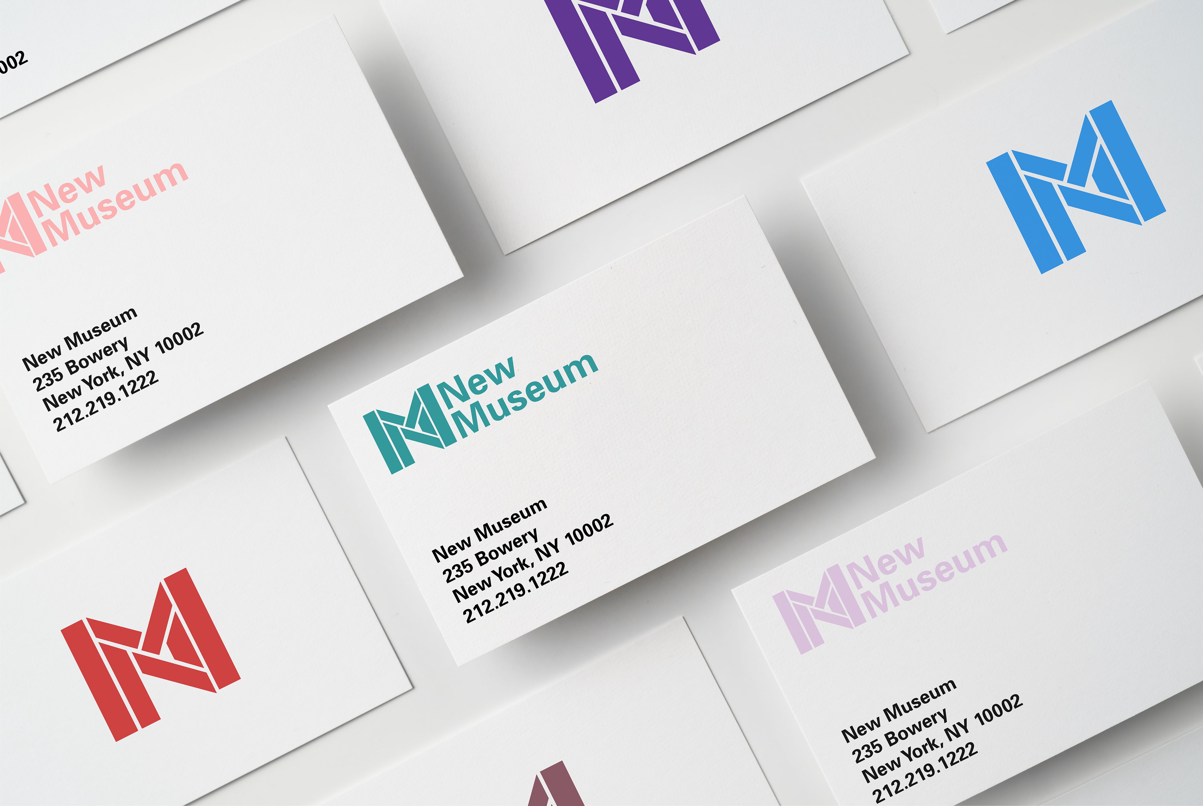
The development of the logomark began with a concept of simplifying the New Museum's current look, mostly by creating a shape to go off of instead of primarily typography-driven design. The M defines the outer and main shape, with the N tucked underneath. This way, the brand is expanded and allows for numerous iterations and applications.
BUSINESS CARDS

EVENT POSTERS
POSTER SYSTEM
The restraint in the layout allows the logo and secondary marks to shine.
WEBSITE BANNERS
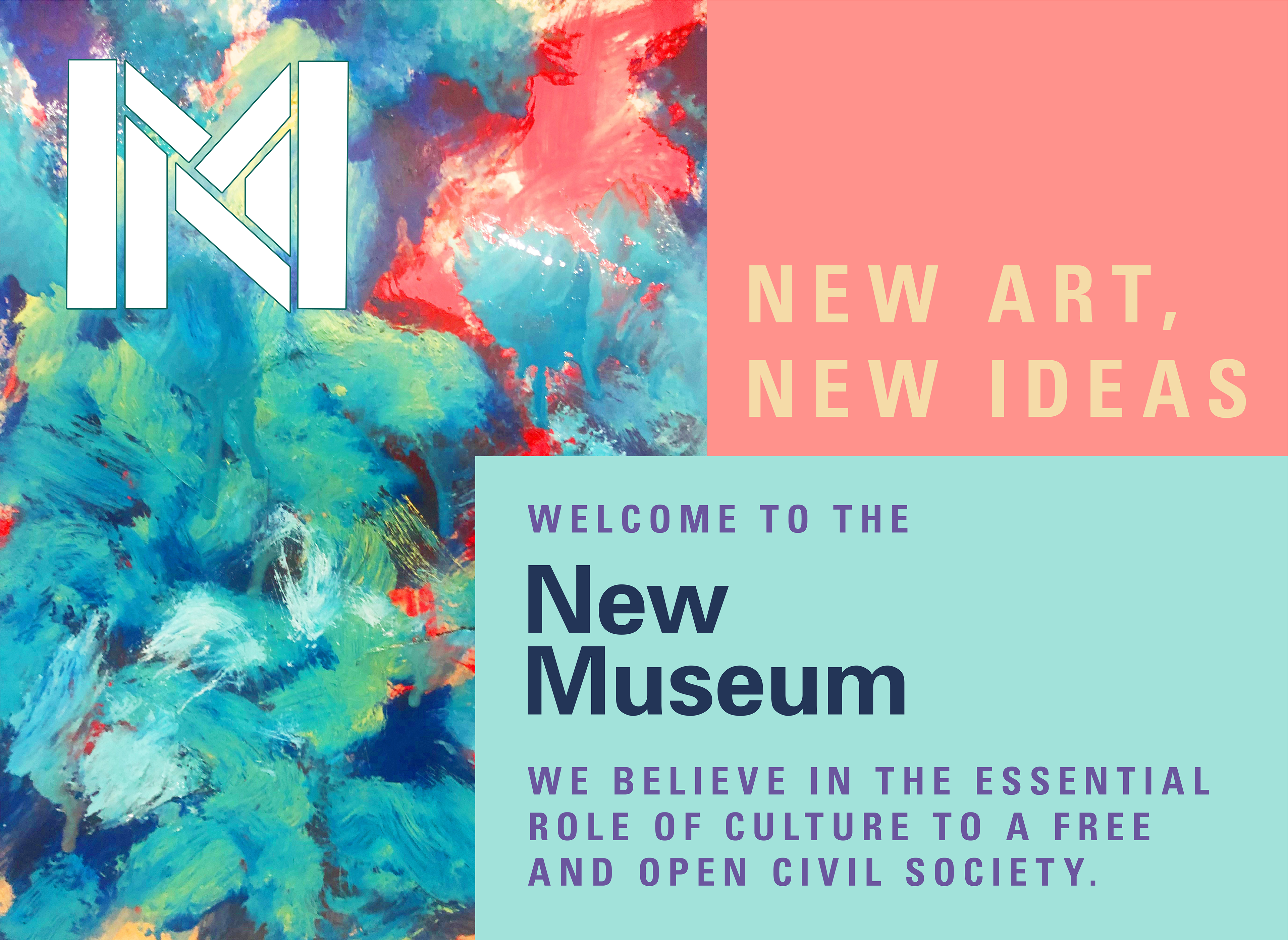
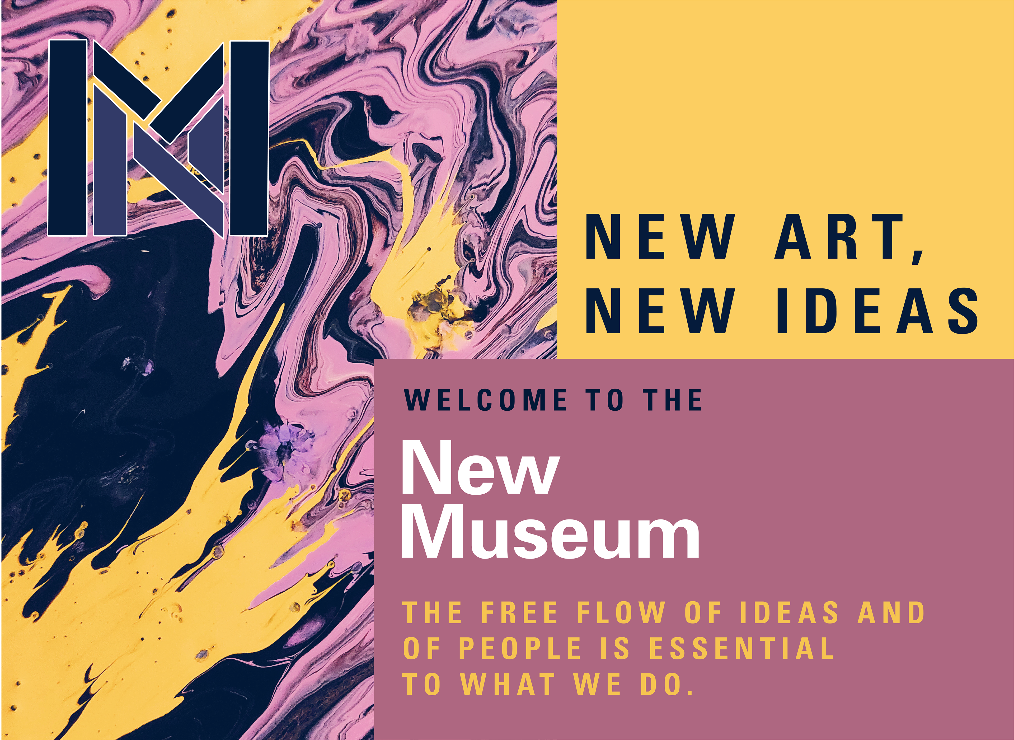
To introduce their new look, I included phrases from their mission statement so that the viewer quickly understands what the New Museum believes in.


CAFE
NEW MUSEUM OFFICES
Sleek and open for color or images from any collections and exhibitions.